Having tokens does not save you from the two-week audit. I have reviewed systems with their token layer built and synced to Figma where a change of corporate colour still cost forty files touched and a round of visual regressions in production. What failed in all of them was distance: there was a single hop between the token and the component.
When a button consumes --color-brand-primary, the name is well chosen, the
variable exists, and the coupling is exactly the same as with a hand-written
hexadecimal. On rebrand day someone has to decide, component by component,
whether that “brand primary” was the background of the primary action, the border
of a featured card or the colour of a link. Three different decisions that shared
a name, and none of the three is written down anywhere. That is where the two
weeks go, not in the replacement.
The architecture that solves this is organised around questions rather than tokens. There are four, each layer answers one, and none can answer another’s.
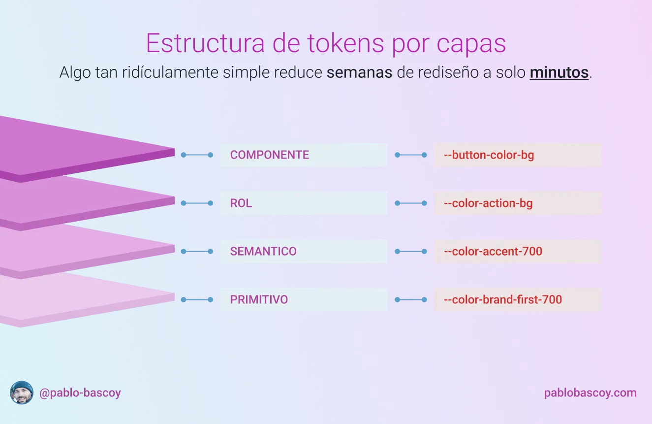
What question each layer answers
In the system behind this site, the chain that ends up painting the background of an accent button is four declarations spread across four files:
/* 1. Primitive: a value and no context */
--p4-color-brand-first-100: #c6e070;

/* 2. Semantic: what part that value plays within the palette */
--p4-color-accent-100: var(--p4-color-brand-first-100);

/* 3. Role: what function it serves in the interface, in this theme */
--p4-color-action-accent-bg: var(--p4-color-accent-100);

/* 4. Component: the button's own scope */
--p4-button-color-bg
The primitive answers “what colour is this”. It is the raw material, it lives in
a single file, and its value lies in the fact that none of its declarations knows
what it is for. A #c6e070 is not a background or a border or a text colour, so
the question “how many greens are in production” has an exact, verifiable answer.
The semantic layer answers “what is this colour to the brand”.
--p4-color-accent-100 designates the system accent, whether that is this lime
today or whatever the brand decides two years from now, and it says nothing about
where it gets used. All its declarations have the same shape: an alias pointing
at a primitive.
The role answers “what function does it serve in the interface”.
--p4-color-action-accent-bg is the background of an accent action, and that
describes a behaviour. A button, a link styled as a button and a selectable row
share a role even though they share no component.
That leaves the component layer, which answers “and in this particular element,
what”. --p4-button-color-bg is the button’s escape hatch, and in this system it
is not declared in any file: it appears only as the first argument of a var(),
with no value assigned, so that a page can override it in a one-off case without
forking the component. Its health is measured by how rarely it shows up.
The role layer is the only one that switches
Almost every three-layer system I have read merges the semantic and the role into one level, because from the outside they look like the same abstraction: both are “names with meaning” as opposed to a hexadecimal. Separating them has an operational justification, and it shows up when you look at which file changes when something changes.
The semantic layer is invariant. It does not depend on the theme, the viewport or the pixel density. The system accent is the same in light and in dark. The neutral scale is the same on mobile and on desktop. That file gets touched when the brand changes, and only then.
Role tokens are the opposite: they exist in order to be switched. Here is the same role in both themes of the system:
:root, [data-theme='light'] {
  --p4-color-action-base-bg: var(--p4-color-neutral-970);
  --p4-color-action-base-fg: var(--p4-color-neutral-30);
}

[data-theme='dark'] {
  --p4-color-action-base-bg: var(--p4-color-neutral-30);
  --p4-color-action-base-fg: var(--p4-color-neutral-970);
}
Both blocks reference the same two semantic tokens, swapped. If the role and the
semantic lived in the same layer, that swap would have to be written by
redefining the palette, which is precisely what produces the absurd result of a
token called neutral-30 that in dark mode is nearly black. I have seen that
solution in production more than once, and it always ends the same way: nobody
trusts the name of any token, so everyone checks the computed value in the
inspector before using it.
The semantic layer and the role layer answer to independent axes. One changes with identity, the other with the presentation context. Separating them costs one file and one more hop while debugging; merging them costs the reliability of the names, which is the only thing that makes a token useful.
The brand enters the system through one line
Of the four layers, only one touches the brand, and its contact surface can be
pointed at. In this repository, the primitive --p4-color-brand-first-100 is
referenced by the semantic token file and nowhere else. The semantic
--p4-color-accent-100 is referenced by the two theme files and nowhere else. No
component mentions either of them.
Changing the system accent means reassigning that alias to a different primitive. The accent button background changes, its hover state changes because it belongs to the same role family, the accent surface on cards changes, and no component file is opened.
What remains afterwards is a single manual check, and it is about contrast. The
text on the accent button is pinned to --p4-color-neutral-970 in both themes
rather than inherited from the generic text colour, because the
background/foreground pair is one decision and not two independent ones. With the
current lime it gives 13.88:1; with the light text of the dark theme it would
give 1.41:1. A new accent forces that verification to be redone in both themes
before the change can be called good, and that is ten minutes.
Dark mode stops being a project
The dark theme in this system is a file of reassignments to different primitives, without a single media query inside a component and without a single condition in the interface code. That is the whole of dark mode.
The mechanism extends to any new axis. There is one token file per viewport step,
and the button’s typography changes when crossing a breakpoint through the same
mechanism by which its colour changes when crossing a theme. The component writes
var(--p4-typo-action-m-font-size) and has no idea which of those files won the
cascade. Theme, resolution and viewport are independent axes handled with a
single mechanic: files that reassign tokens which already exist.
Multi-brand capability is that same mechanism applied to the semantic layer instead of the role layer. A new brand is a file of aliases pointing at different primitives, and the top half of the system never finds out.
What the fourth layer costs
Four levels of indirection have a price and I would rather quantify it before recommending them.
Debugging stops being immediate. Working out why a button renders in a particular
colour means walking the whole chain in the inspector down to the literal, and
anyone new to the system has to be told why the same #050505 has three
different names depending on how far up the chain you look. In a debugging
session under time pressure, that is real minutes.
There is also a crack the architecture permits and that is worth watching. Some roles point at other roles instead of at a semantic token:
--p4-color-action-ghost-fg: var(--p4-color-surface-base-fg);It is deliberate, because a ghost button has to take the text colour of the surface it sits on, and that relationship is more stable than any specific value. But it breaks the rule that each layer only references the one immediately below it, and in a repository with more hands that shortcut spreads until the role layer becomes a graph instead of a level. Today it is held up by review and not by a lint rule, and that is the debt this setup carries.
The other exception is smaller and also deliberate:
--p4-color-action-base-border: transparent is a literal written inside the role
layer. I considered creating a primitive for transparent and keeping the model
pure. I dropped it because a token that can only ever hold one value adds no
capacity for change, only one more hop, and the tidiness of the diagram is not a
good enough reason to pay for it.
Three layers are enough more often than it seems
The four-layer architecture answers a specific problem, and outside that problem it is bureaucracy.
With a single product, one brand identity and two frontend people, the chain from primitive to semantic to component covers everything that is going to happen in the next two years. The discipline to sustain there is not architectural but hygienic: that no component ever writes a hexadecimal. Adding the role layer in that context creates one more file to maintain and one more thing to explain at every onboarding, in exchange for flexibility nobody is going to exercise.
The fourth layer starts to pay for itself when a second axis of variation appears. Two themes is the most common case and the cheapest to spot. Multi-brand, multi-platform with iOS and Android consuming the same source of truth, or a product sold with the client’s visual identity are the cases where leaving it out merely postpones the work. The debt comes due the day the layer has to be introduced into a system that already has components written against the previous one, and that migration does cost the two weeks we started with.
The test I apply to decide fits in one question: is there any context in which this same element must look different without ceasing to be the same element? If the answer is no, three layers. If the answer is yes and there is no role layer, the system is already accruing the debt even if it does not show yet.
The full anatomy of the chain, with the double indirection that turns a component into an API and the case of theme islands, is in Design tokens as a single source of truth.